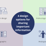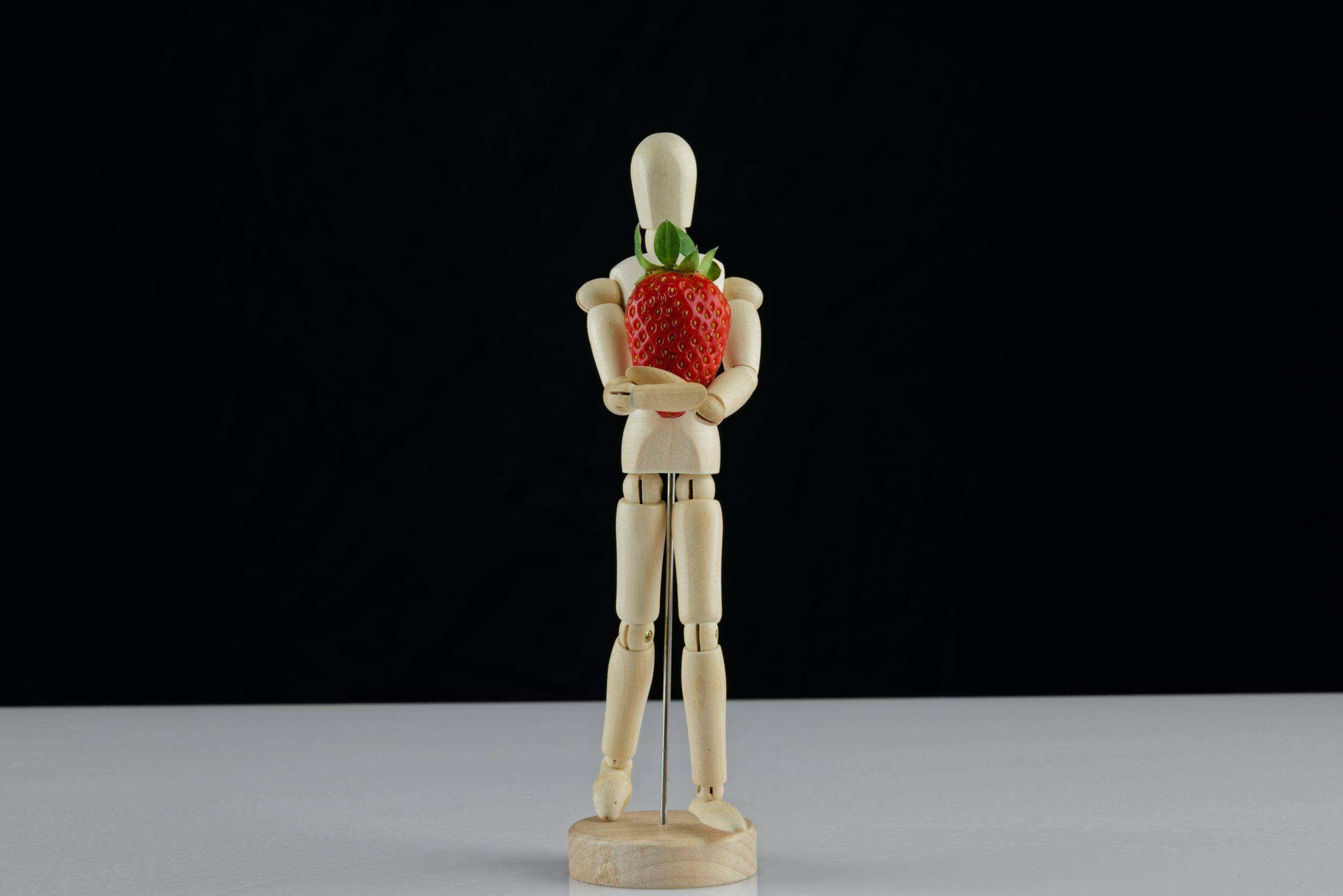
I joined Marcelle and a small group for Design Discussions this morning. We had a great discussion around the concepts of what makes an Anatogram (Marcelle’s own word for the anatomy of a subject).
From my perspective an anatogram can show the most important parts of a subject. It can show the positives or negatives, the healthy or unhealthy. It takes simple pictures and text and transforms them into ideas that are bite-size and eye-catching.
Netflix does something similar with shows they are advertising. With words like “witty”, “swoonworthy”, or “campy” helping you choose the best show for you. Marcelle takes it a bit further though, her anatograms meshing ideas with photos. Corresponding photographs showcase the highlights surrounding your subject and add extra visuals.
Many businesses and thought leaders post singular photos and blocks of text… and there is nothing wrong with that but often times that isn’t enough to stop the random facebooker from scrolling on past. If you want to provoke thought and engagements, anatograms can be a facilitating tool to do that.
I often find most social media bland and a little “flat”, but using anatograms could change how people engage with posts, shift your consumers’ perspective on your subject, and also give them the bite-sized anatomy of your information.
I look forward to more people using anatograms and more design discussions about how to use visuals and words in new and engaging ways on social media! Make it useful, make it beautiful… create something amazing. Let’s keep improving the conversations.
If you want to eavesdrop on our conversation you can listen to it here: