Do you want to be a specialist or a generalist? Your content is a reflection of your intelligence and skills and heart vibe. Would the content you design help another make a decision?
Speed is of remarkable importance when facing an important decision. Massive chucks of text doesn’t move information quickly, some decisions are split decisions made in a moment. Our eyes process information much faster but knowing the “right decision” is always debatable. I recall a time in life when I google and ONLY clicked on “images” to do my research. I wanted fast, helpful, and easy to understand information. You may have a time when you’re depending on the published knowledge of someone else to make a life saving decision, or just a delicious recipe.
Design idea!
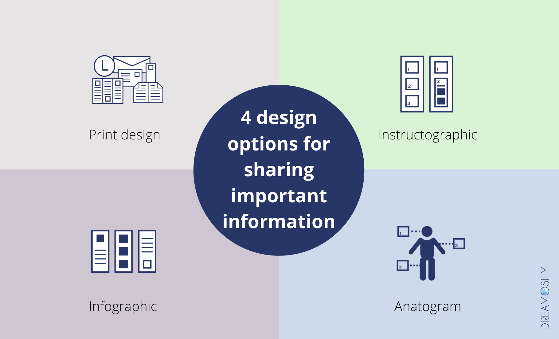
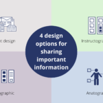
Imagine if every blog post, at a minimum, provided 4 crystal clear options. One would be worst case scenario, one mediocre option, one decent option, and one remarkably wise option. See my 1st attempt at an example below!
Based on what life experience we have, we would pick one.
Each option might be weighted A, B, C, D (nearly failing)…
As content creators learned more, each option would improve or shift with new life experiences.
The reader would always benefit, and always be able to respond with their own 4 options after they took action.
Stock image options don’t really show that you are an expert. They show limited understanding of a topic. These images often help us associate what the writer is trying to discuss and share but often when the images rank in the search engines, they lessen in value.
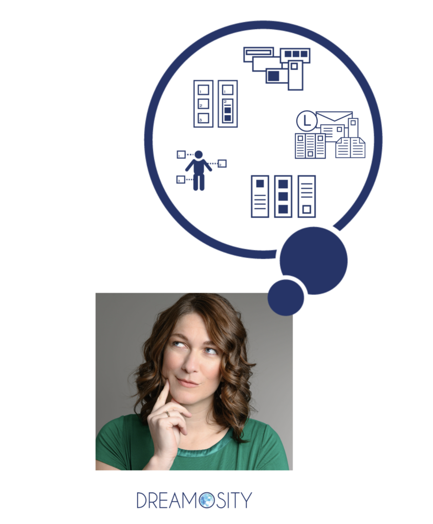
Anatograms show a depth of knowledge, highlighting key topics or points of concern.
So let me ask again, do you want to be a specialist or a generalist?
Even a generalist with organized information, may be more useful than specialized information that takes too long to consume.
I assigned a task to a smart women, a LAF Tech grad, to organize 40 key decisions onto index cards. I said make a quadrant of 4 possible choices a person could make.
40 choices someone could make on the path as an executor.
Some people would make A decisions for some, B’s for other, etch. Some might make all D’s & C’s
But visually you could showcase patterns in a linear fashion to show knowledge at that time and place.
A decade later, folks should be preforming better.
What choice are you really helping them make?
Some choices leave a pleasant result. Some poorly informed choices provide chaos and crazy making.
Choices change across the miles, whether emotionally, physically, spiritually, or financially.
Choices of our peers or support group vary greatly based on their skill set to handle tough choices. Do they get greedy or do they have peace of mind with their financial results. Do they try to control the emotional well-being for lack of spiritual insight? Would they avoid the situation all together?
These aren’t easy choices. Generational confusion and avoidance has spilled over.
Processing grief is hard but processing information is possible.
To cause pain to someone on purpose is malicious, but what about on accident?
“Life isn’t fair” is a weak content creators line.
What if we cared kindly, and clearly, about those 40 end of life choices.
What if information was easier to grasp and decide. This speech I gave on 21 visuals every brand should have for more impact. I’ve been inspired lately by the creators making anatograms in reels, shoutout to Karen Koenig for this recent one!
If anatograms, or even a 4 quadrant grid, could steer our desire to control an outcome, to bring peace and harmony to a community…
When will the process after death was easy to navigate for caregivers, execrators, families, lawyers, and new & old family members?
We must learn faster
Could an (entitled, confused, overwhelmed, unwilling) generation could shift focus… faster?
Improve the design of your blog content with anatograms, infograpics, instructographics and be clear on what decisions you actually want to help people make.

